MaidPro Franchise hosts a franchise-wide convention every 18 months where the community can come together. During the days-long gathering, wins are celebrated, learning experiences are reviewed, and the relationships between franchisees and the Home Office employees who support them are fostered.
Each convention boasts its own theme relevant to the location, with a logo, tagline, and supporting collateral to match.
Logo Design
The 2018 MaidPro Convention was held in San Juan, Puerto Rico. To represent the culture and overall setting, potential themes were narrowed down to Carnaval and Beach Party: vejigante masks (specific to Puerto Rican folklore and Carnaval), ribbons, and beach imagery.
Working directly with the CEO, the theme and imagery were narrowed down to Carnaval and vejigante masks. Specific guidelines were added: to only use MaidPro blues, and make the vejigante mask concept work within the constructs of MaidPro’s bubble motif.
Typography
GOTHAM
Primary Text
GOTHAM ROUNDED
Primary Display
EquestRia
2018 Convention Display
The goal was to find a display font that elicits the same emotions as Carnaval itself: excitement, joy, and amusement. Equestria’s typeface characteristics give it a funky and fun vibe, and immediately evokes imagery of lively entertainment.
Equestria is only available in capitals.
Color Palette
MaidPro Brand Identity
Convention Identity
Carnaval is a complete feast for the eyes with colors, characters, and drama. The MaidPro Convention color palette simultaneously compliments MaidPro’s blues, but also pops (as Carnaval does).
Brand in Action
ON-SITE DIRECTIONAL SIGNS
24 x 36 in | 3/16 in foamcore board
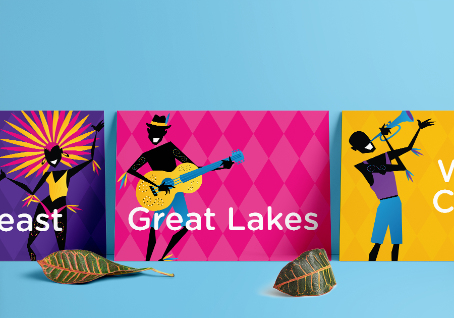
Directional signage is setup throughout the convention venue on easels to help attendees find their way to different discussions/rooms, vendor areas, food breaks, and special events.
The use of color gradients, a diamond pattern texture, and dancers help bring the MaidPro Carnaval to life, and compliment the 2018 MaidPro Convention logo. The diamond pattern is only used on forms of wayfinding signage (directional and table cards).
Awards Placards
16 x 20 in | 3/16 in foamcore board
Awards placards are used during group photos during MaidPro’s awards ceremony where franchisees are celebrated for making new business milestones.
A second background texture—a fractal pattern—is used on collateral that is not wayfinding. With a total of 11 placards in this series, the six Carnaval colors rotate through each placard to keep separate identities among the awarding groups.
Vendor Signs
22 x 28 in | 3/16 in foamcore board
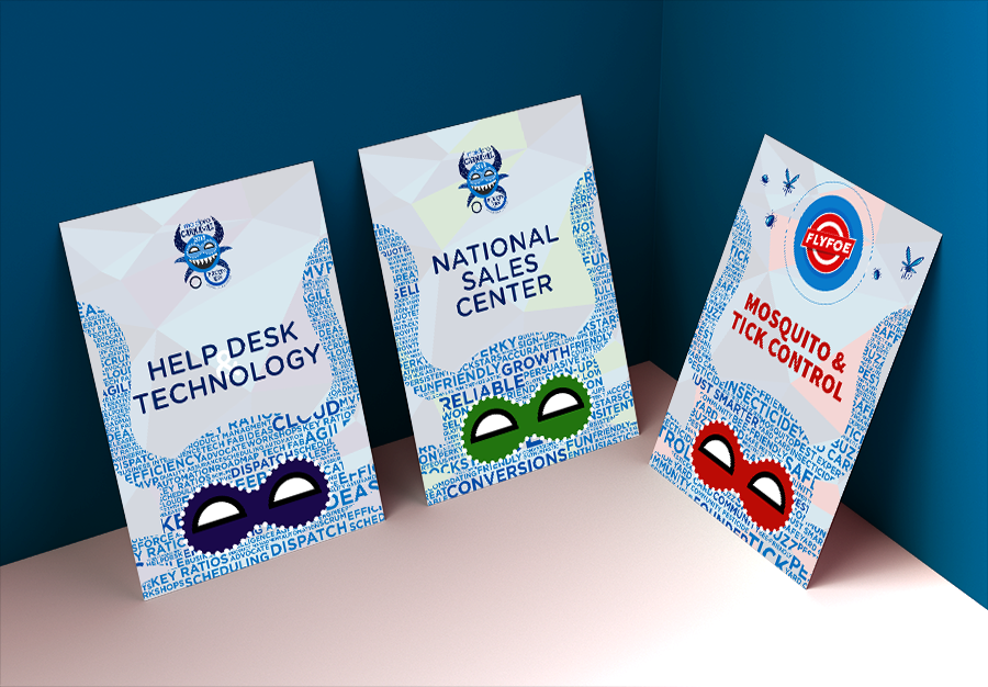
In-house vendors setup information booths to discuss what they do and how they can help franchisees. At the 2018 MaidPro Convention, FlyFoe—a new brand created by the same owners of MaidPro—is rolled out to the community.
Each vendor sign has its own identity: one color is represented via the vejigante mask and fractal background, and a word cloud with descriptors of the vendor. The vejigante mask used for the word cloud is different than the one represented in 2018 MaidPro Convention logo.
Roundtable Table Cards
7 x 5 in | 120# cover
Table Cards are used to easily create and organize groups for large roundtable discussions.
To bring all of the signage full circle, individual dancers from the bottom of the directional signs are used on each table card.
Presentation Slides
Branding on the presentation slides must be simple and balanced as to not distract from the content, but still remain true to the theme of Carnaval. The dancers used on the bottom weight of direction signage are used here on a white background at 20% opacity; bullets are broken down onto color-blocked diamonds.


